A new version of the video streaming app for TV, web and iOS, based on research findings. It makes registration simpler and makes content easier to discover.
+56%*
Direct-to-consumer views in 2023, the year 3.0 shipped
+48%*
Monetisable views in 2023
6
Platforms across TV, mobile and web
* Whole-service figures from UKTV (source). Content and marketing played a part too.
About the project
A free streaming service built around four channels: Dave, Drama, Yesterday and W.
My role
Led user research and UX design
Workshop creation, organisation and facilitation
The UX and UI for the mobile app (iOS), TV and web
Design system creation from scratch
Worked with the PM, a product designer and the main stakeholders
01 · The problem
Nothing new to watch
Research showed people were leaving because they couldn't find new or relevant content. Younger viewers found it dull. Many visited once and never finished registering.
3 challenges
Attract a younger audience without losing the existing linear-TV viewers
Make content discovery feel natural instead of hard work
Make the value of signing up clear, and fix registration and device linking
Hmm, when was this show added? It doesn't look like there's much content to explore.
Francis, lapsed viewer
Weak recommendations and not enough new content.
I don't watch linear TV anymore.
James, younger viewer
Younger viewers found it dull. Channels meant little to them.
I'm running late, I need to leave. I'll have to catch up on this episode later.
Helen, loyal linear viewer
People expect devices to stay in sync. Linking often failed.
We facilitated a one-day workshop with the client to agree on what a successful delivery looks like.
Morning
Current product challenges, an optimistic future three years out, and the risks.
Afternoon
Content types and plans, user personas and the future of the brand.
In the room
Product, VOD, digital, marketing, content, insights, advertising and dev teams.
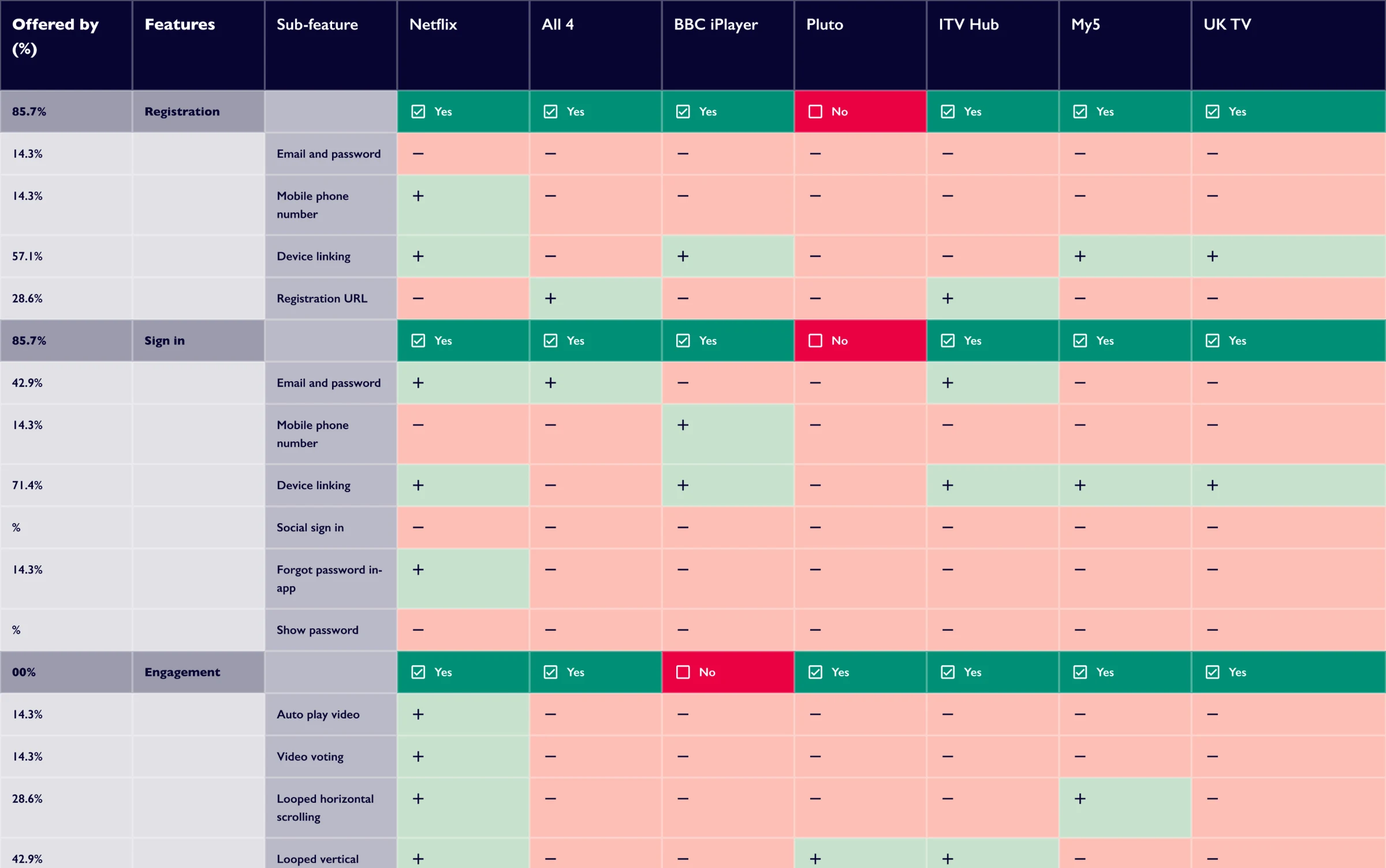
Competitor benchmark, mainly on TV
Registration, login, ads, video player, live channels, TV guide, discovery and retention. Then I compared how the same features worked on mobile and web.
03 · Understanding users
27 people, in their own living rooms
Interviews and observations with current users, lapsed users and people using other streaming services. A mix of ages, backgrounds, accessibility needs and regions across the UK.
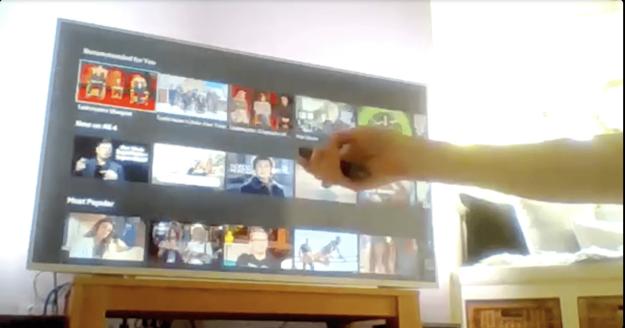
TV testing
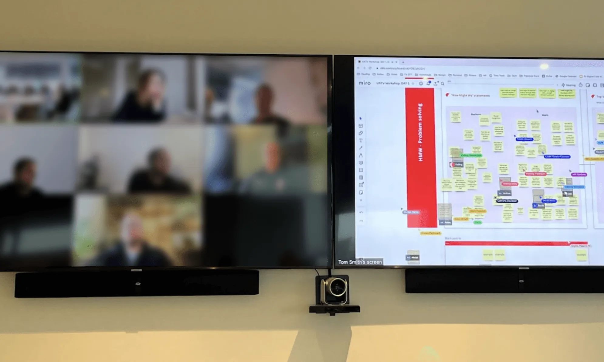
We asked people to set up their laptop 10 to 12 ft from the TV with the camera pointed at the screen. It wasn't perfect, but it showed us how people really use the product.
What we learned
01Not enough new content
Viewers leave because recommendations are weak and new content is limited.
02Linking fails halfway
Device linking often fails when viewers switch to a second device to finish it.
03Channels split the audience
Some viewers only want their favourite channels. Others are open to exploring.
04Devices out of sync
Viewers expect their progress to stay in sync across devices.
05Text on artwork
Text over thumbnails is hard to read for some viewers.
06Low content discovery
On UKTV Play, viewers stick to shows they already know. On Netflix and Disney+, they browse and discover new content.
04 · Define
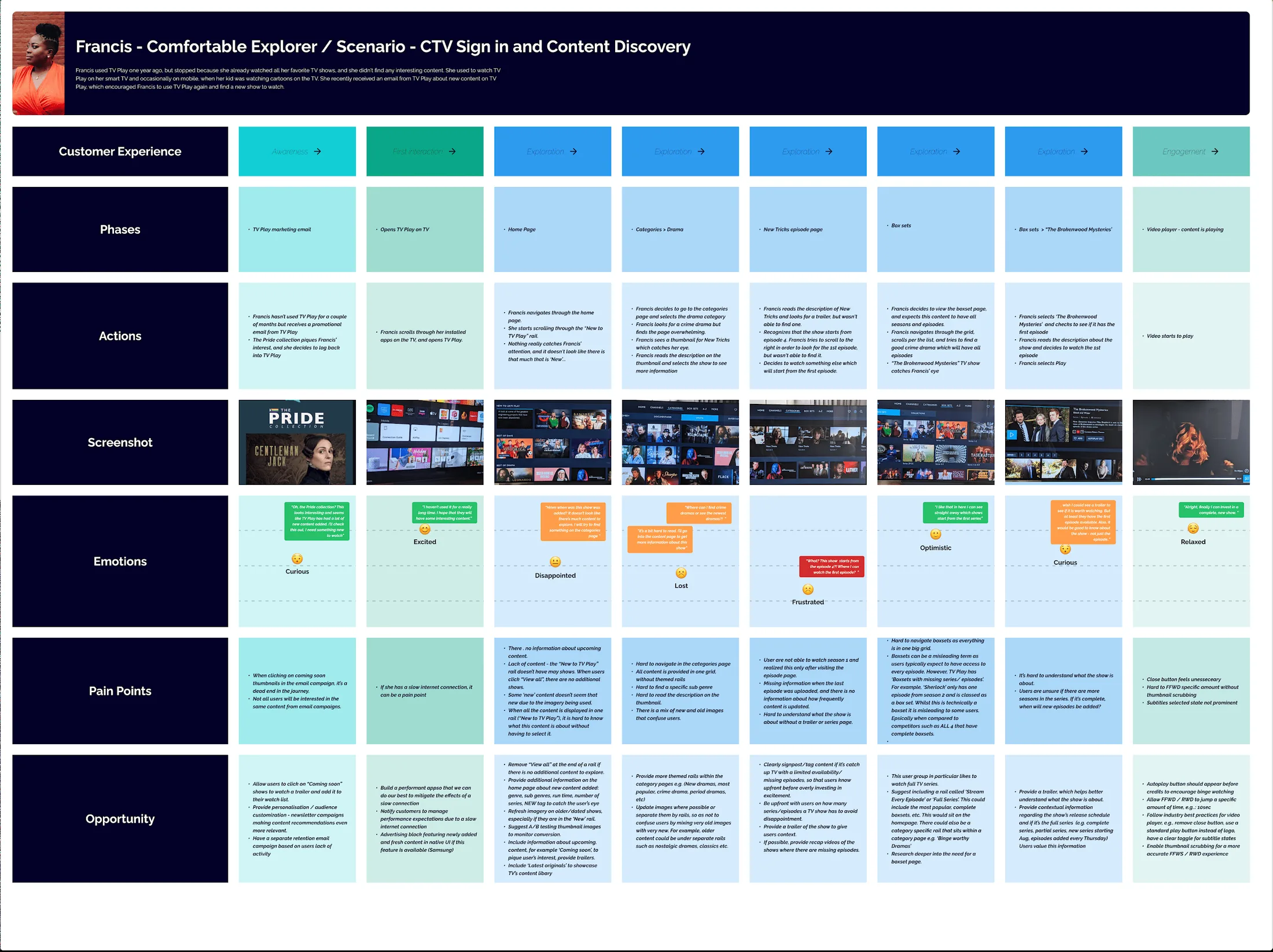
Three personas, six journeys
Built from UKTV's previous research, third-party survey data and our 27 interviews. Pick a persona to see one of their journeys.
Their journey
05 · Information architecture
Structure, then wireframes
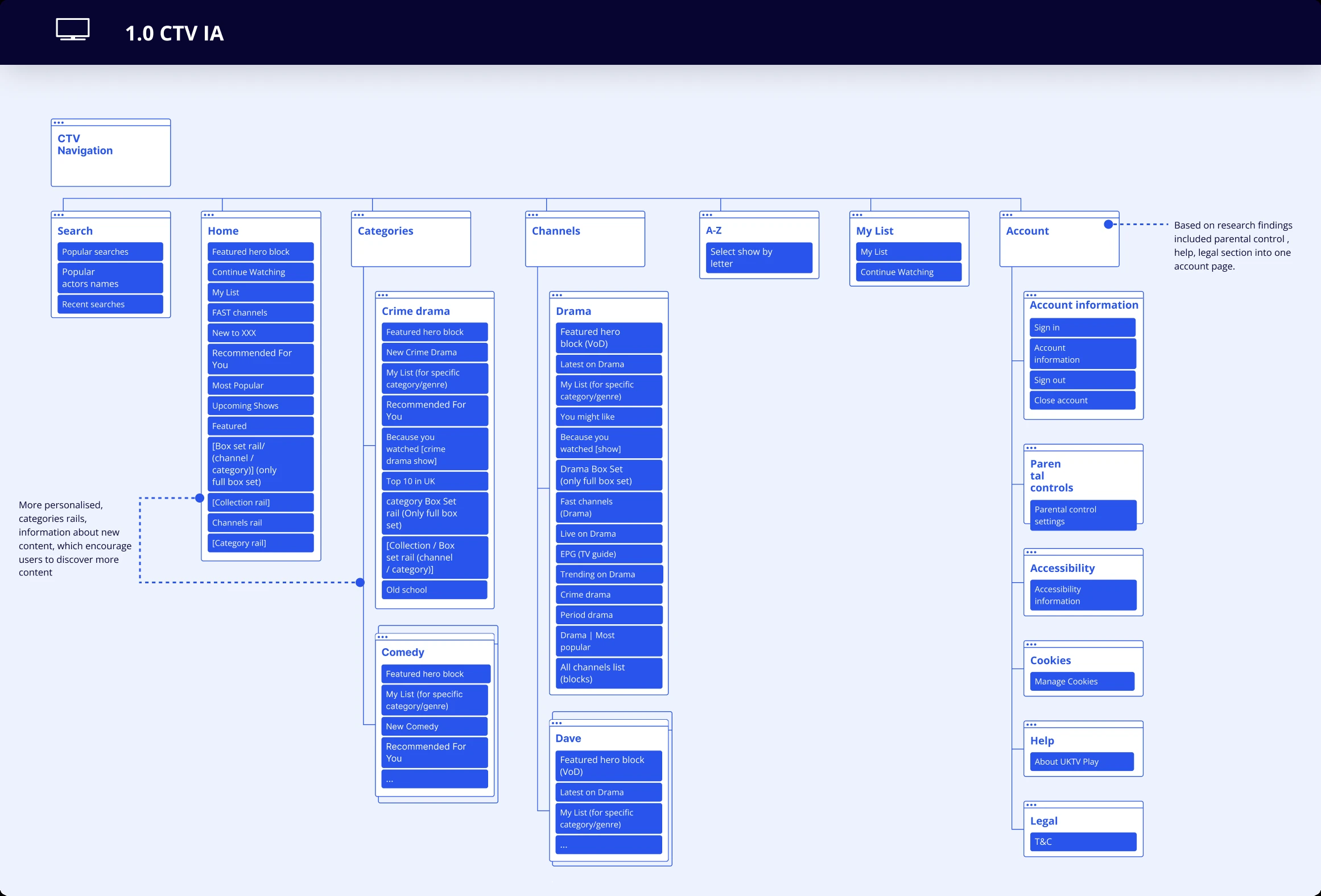
I ran a tree test with 30 people and a card sort with 15, then reshaped the CTV navigation around what we found.
CTV navigation
Search
Popular searches
Popular actors
Recent searches
Home 3
Featured hero
Continue watching
My List
FAST channels
Recommended for you
Most popular
Upcoming shows
Box set rail
Collection rail
Channels rail
Category rail
Categories 2
Crime drama
Featured hero
New, Recommended
Box set and collection rail
Comedy
More categories…
Channels 4
Drama
Latest on Drama
Live on Drama
TV guide
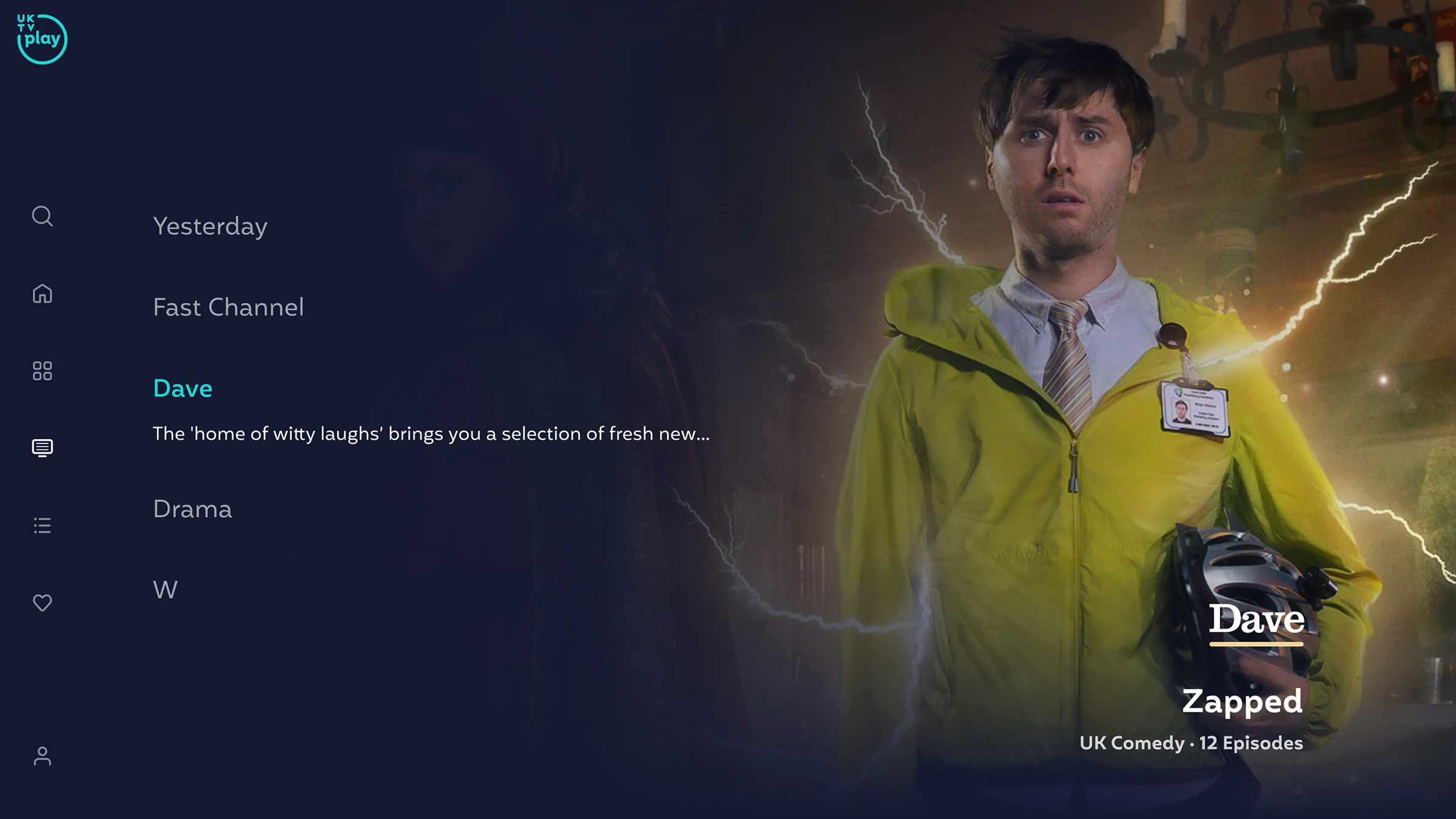
Dave
More channels…
A to Z 4
Select show by letter
My List
My List
Continue watching
Account 1
Account information
Parental controls
Accessibility
Cookies
Help
Legal
Changed after researchKept
1One account page. Help, parental controls and legal moved into Account. Only 4% found support before.
2Fewer places to look. Box sets and collections share one rail. Real Life sits only under Documentaries.
3A more personal home. Recommended and category rails help people find more to watch.
4Kept what worked. Channels and A to Z tested well, so they stayed.
Tree test 30 people · 6 tasks
4%found technical support. Most looked in Account first.
48%found Real Life shows. 7 went straight to Documentaries.
57–74%found A to Z, box sets, Channels and UK Drama.
Card sort 15 people
People sorted shows into groups, so we could see how they expect content to be organised before setting the categories and channels.
See the full IA boardUpdated CTV IA. Parental controls, help and legal now sit in one account page.
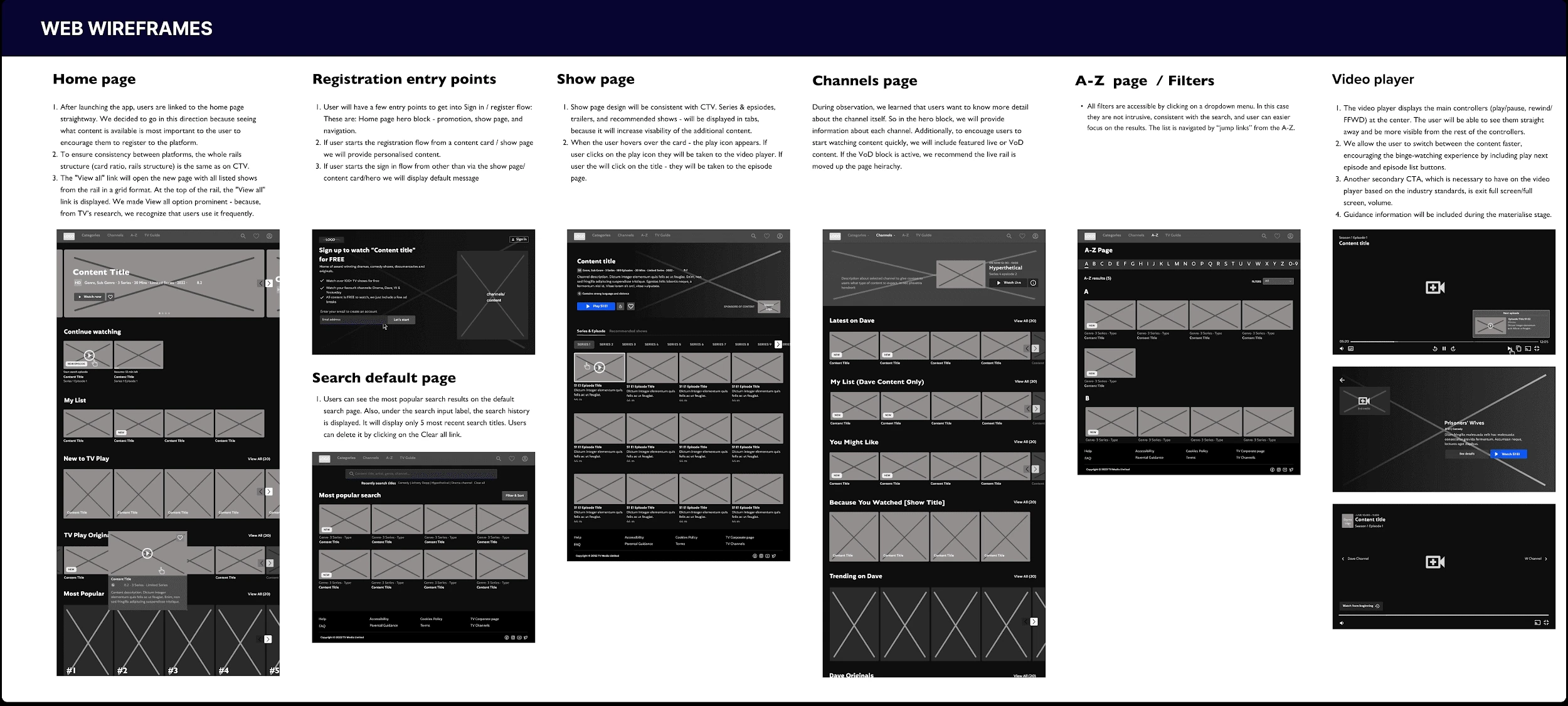
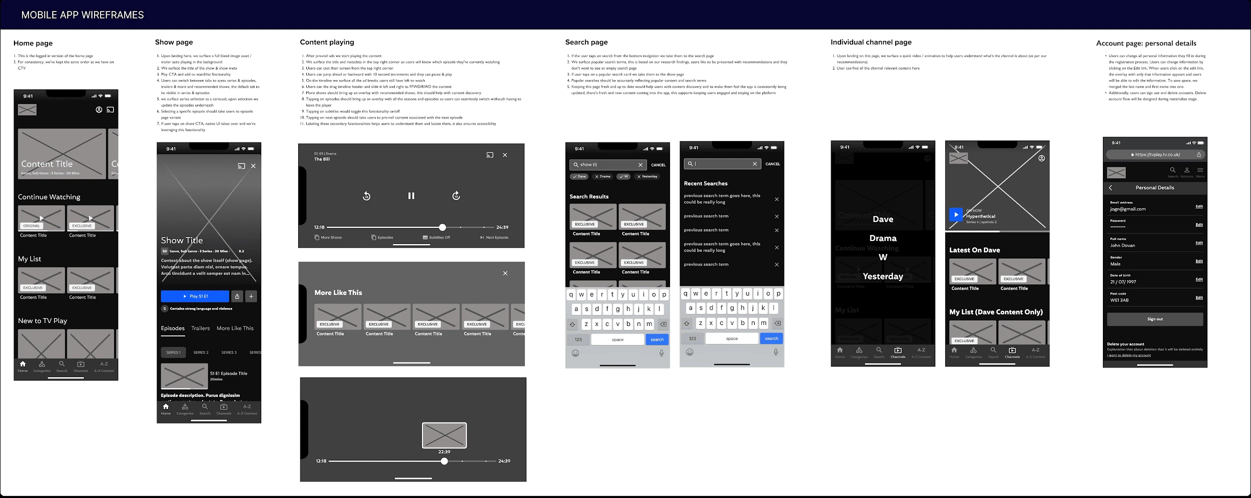
Wireframes for all three platforms
06 · Ideation
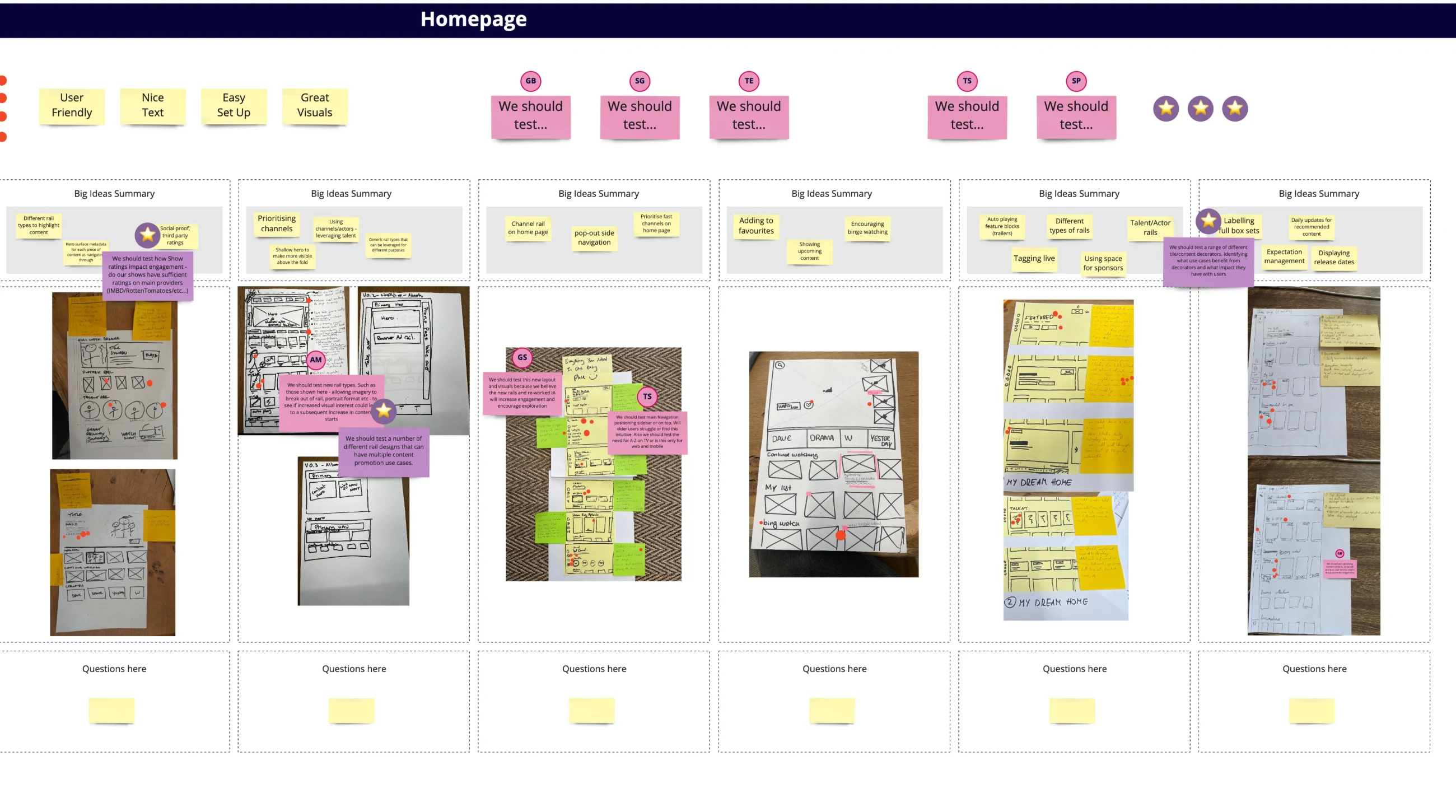
Sketch together, then decide
A two-day sketching workshop on the journeys that mattered most: registration, channels, search, home page and engaging with content. Then wireframes for all three platforms.
Key decisions and trade-offs
Content first, but channels still matter
Exploring content instead of browsing by channel, with a clear way back to favourite channels for loyal viewers.
Trade-off
We risked losing some traditional users. The payoff was opening the product up to a younger audience.
Registration and linking in smaller steps
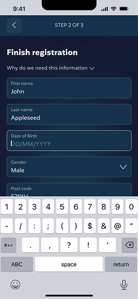
The value of signing up comes first. Device linking got extra attention because it was a major drop-off point.
A design system from day one
Built early, so three platforms could stay consistent and future work could move faster.
Ready for personalisation
The structure lets recommendation rows slot in later. Better editorial and discovery patterns shipped straight away.
07 · Testing and iterating
Two rounds, two fixes
I tested the main journeys with 10 users over two rounds.
The CTV prototype from the tests, with the on-screen remote people used.
Round 1 · we saw
People struggled to see where they were on the TV. Focus states and nav weren't clear enough.
We changed
Bigger CTAs and one aqua focus state across the app, including the nav bar.
Round 1 · we saw
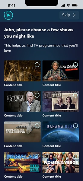
Registration felt too long, because of a separate success screen after the content-preferences survey.
We changed
Merged the survey and the success screen.
Round 2
Confirmed both fixes. Navigation was easier and registration felt smoother.
08 · Final designs
What changed, and why
High-fidelity designs for CTV, web and iOS, with every screen and component annotated for the dev team.
01
Home
What changed
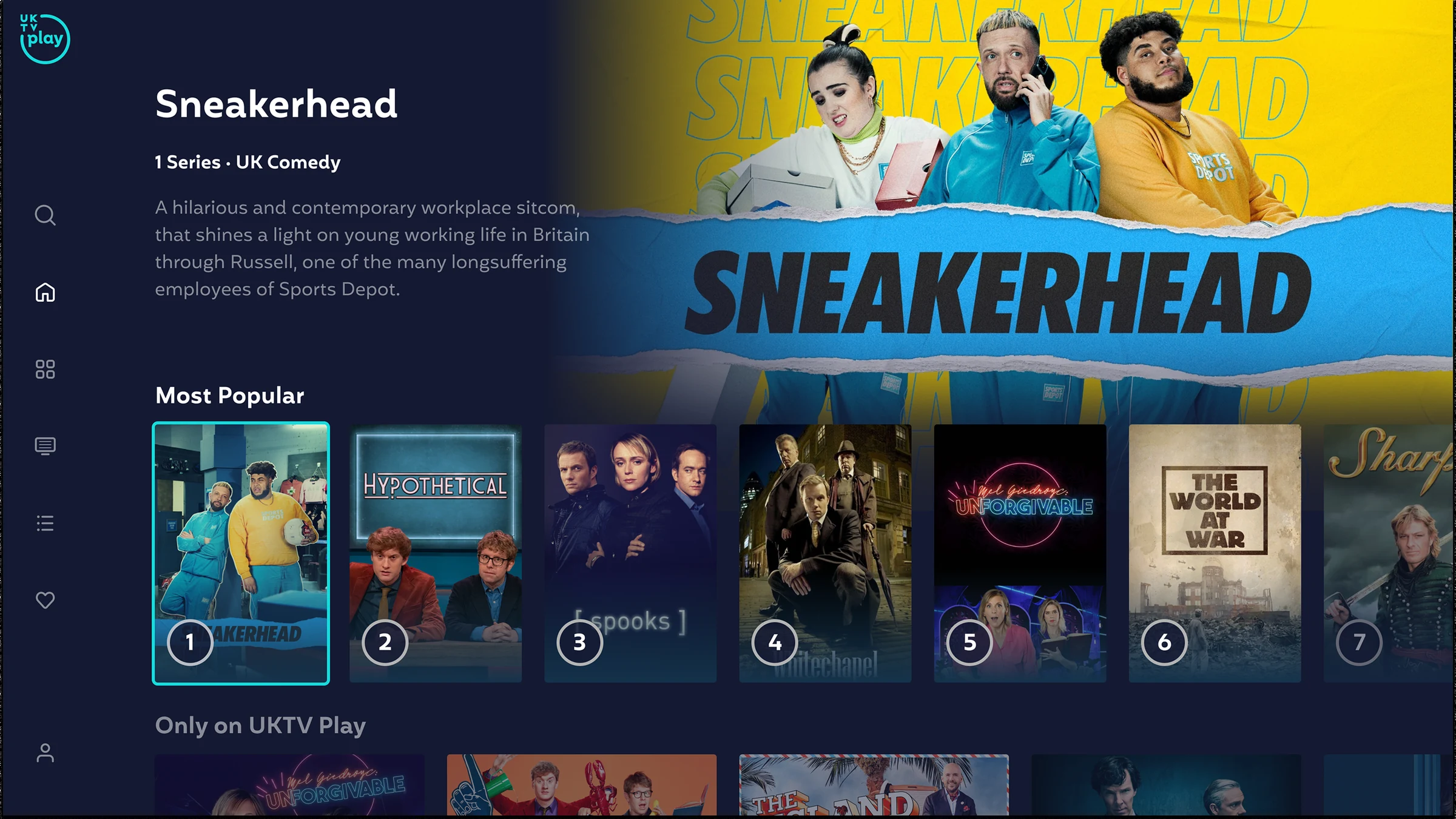
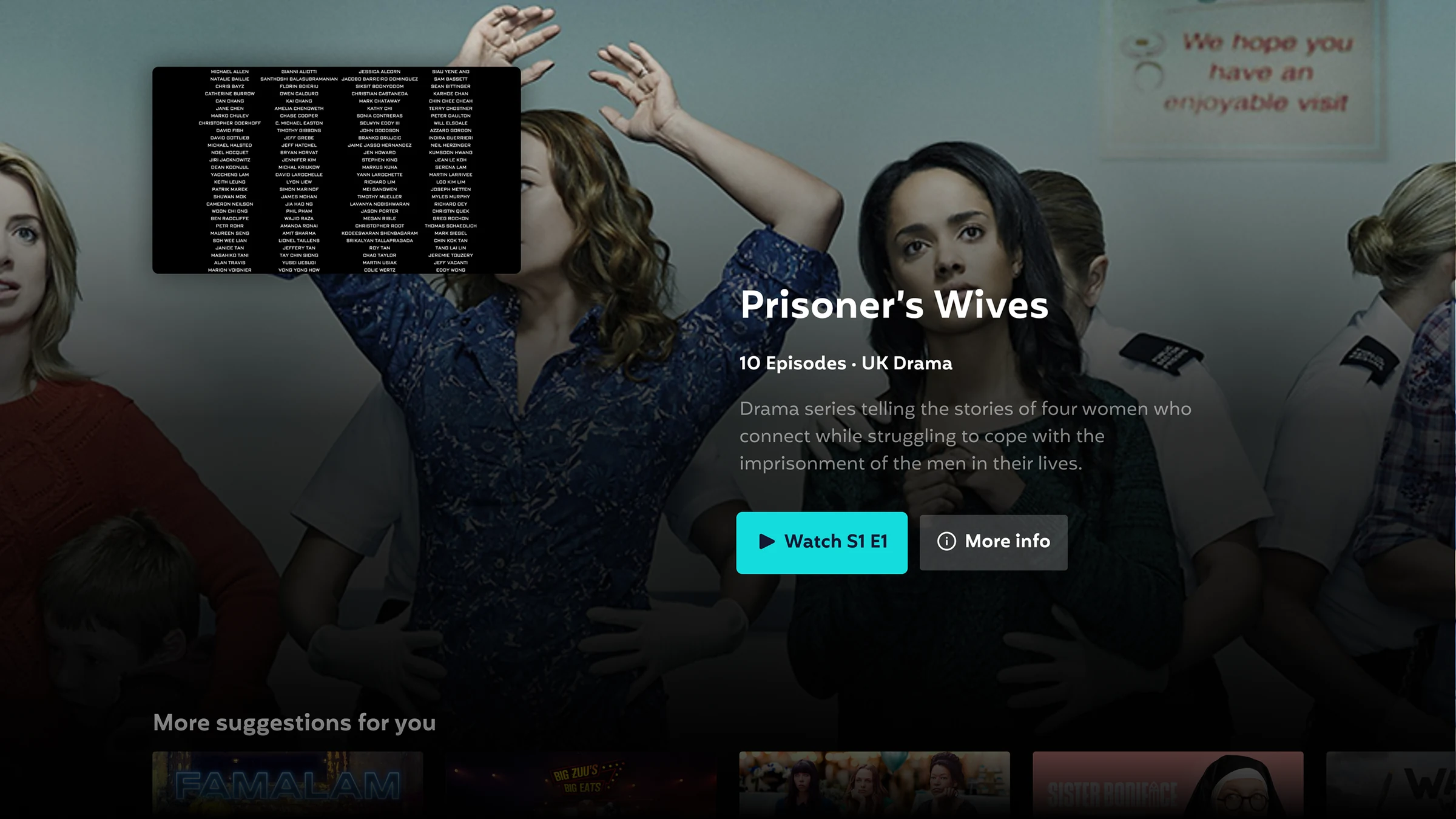
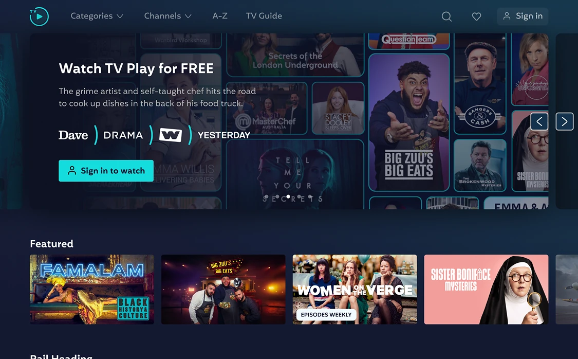
Leads with featured and exclusive content, with show descriptions to help people choose.
Why
People left because they couldn't find anything new. Descriptions sit beside the artwork, not on top of it.
02
Sign-in and device linking
What changed
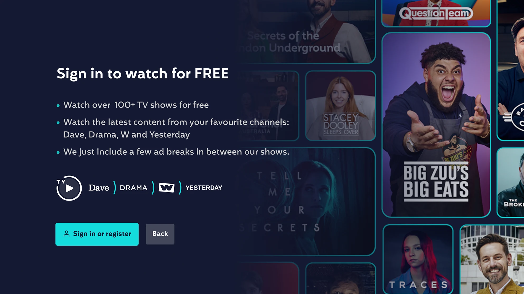
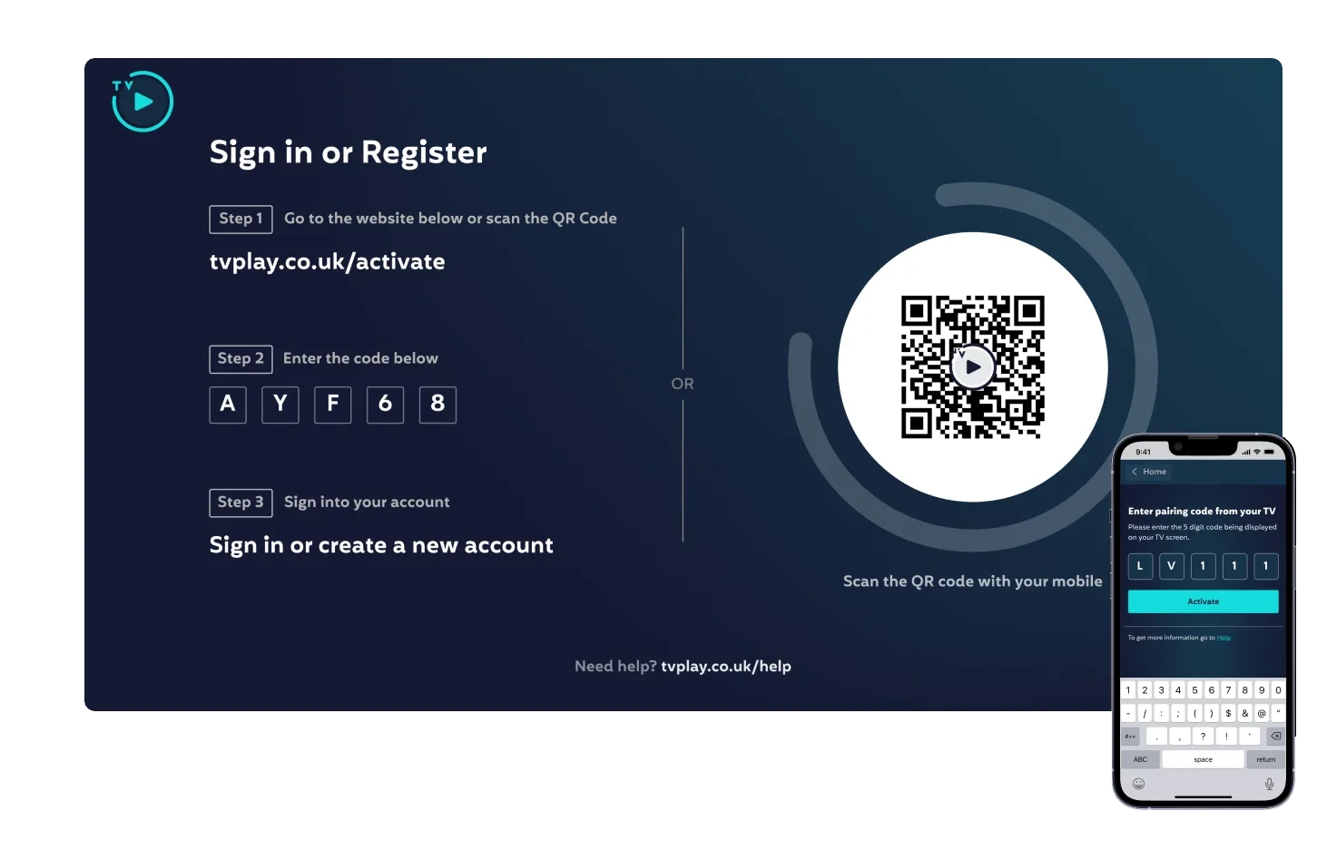
Smaller steps, with clear instructions on what to do on each device. The value of signing up comes first.
Why
Many people visited once and never registered. Linking often failed on the second device.
Sign in: why sign up, before anything else.
Three steps and a QR code. The phone mirrors the TV.
03
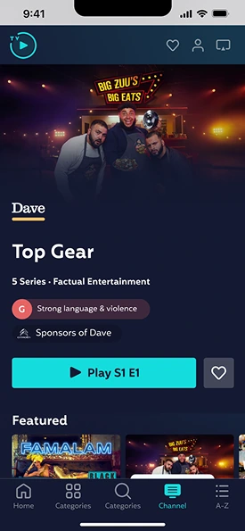
Channel pages
What changed
A one-line description of each channel.
Why
Many users didn't know what the channels were. Loyal viewers still get a clear way to their favourites.
04
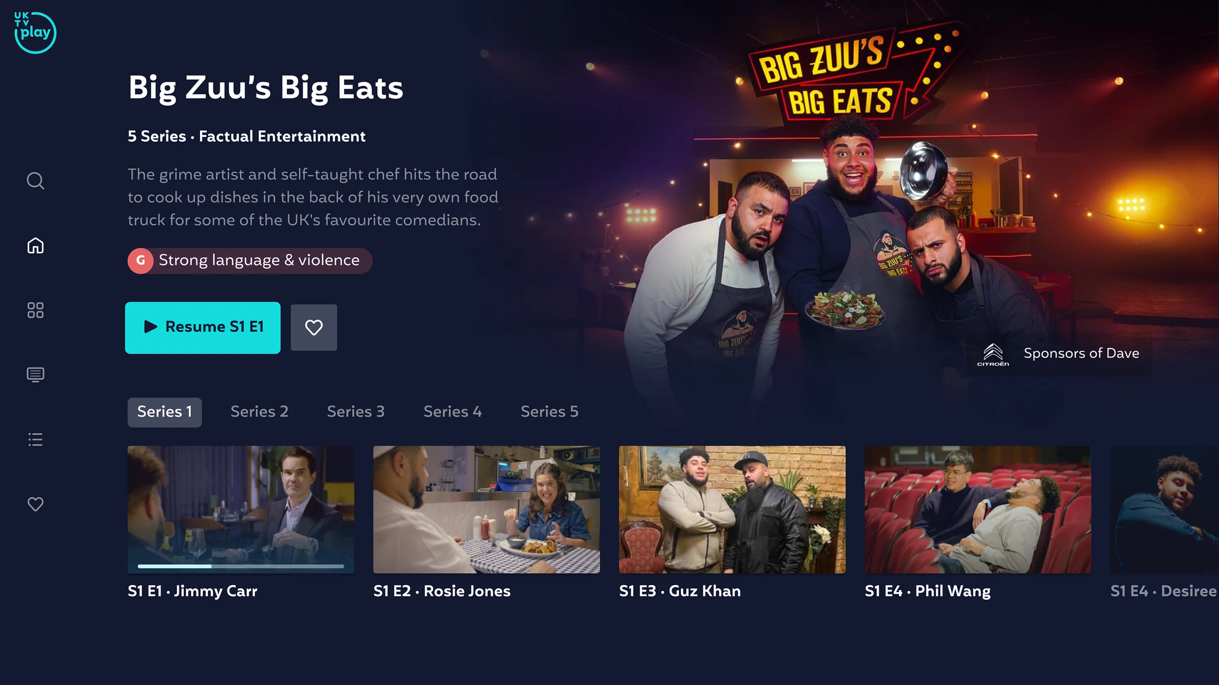
Show page
What changed
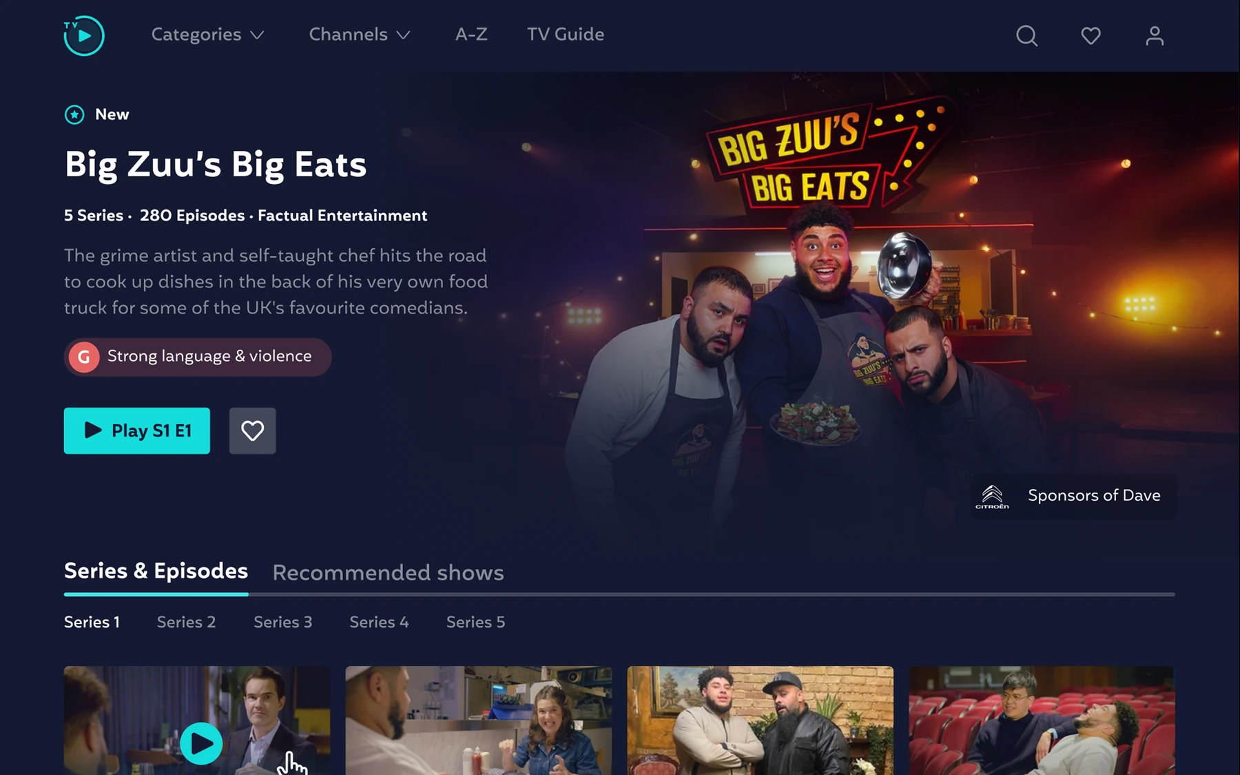
The show leads, with one clear way to play or resume. Series and episodes sit right under it.
Why
In research, people only found out a series was incomplete once they were already in it.
05
Video player
What changed
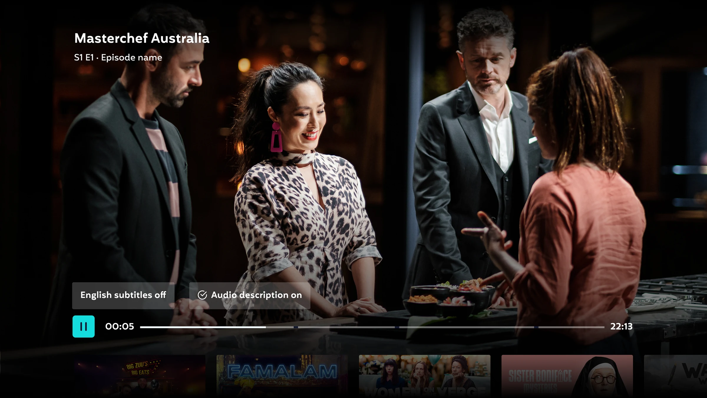
Brought up to industry and accessibility standards, with onward viewing to keep people watching.
Why
Subtitles and audio description need to be quick to reach. And the end of a show shouldn't be the end of the visit.
Subtitles and audio description, one press away.Onward viewing.
06
Search and A to Z
What changed
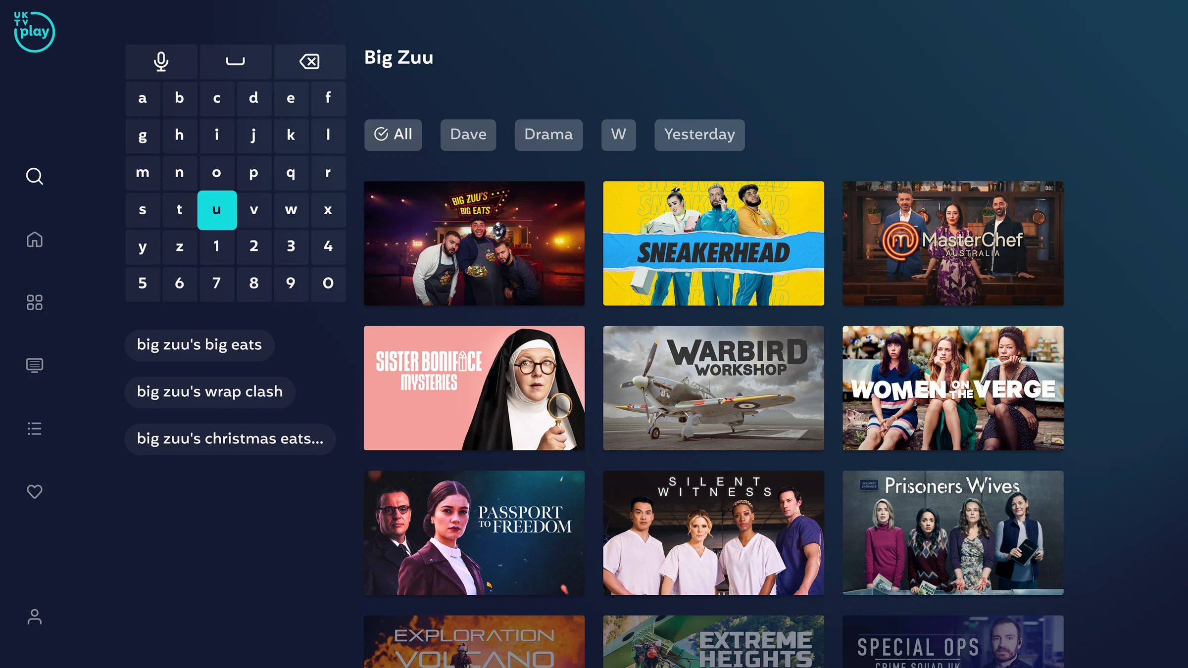
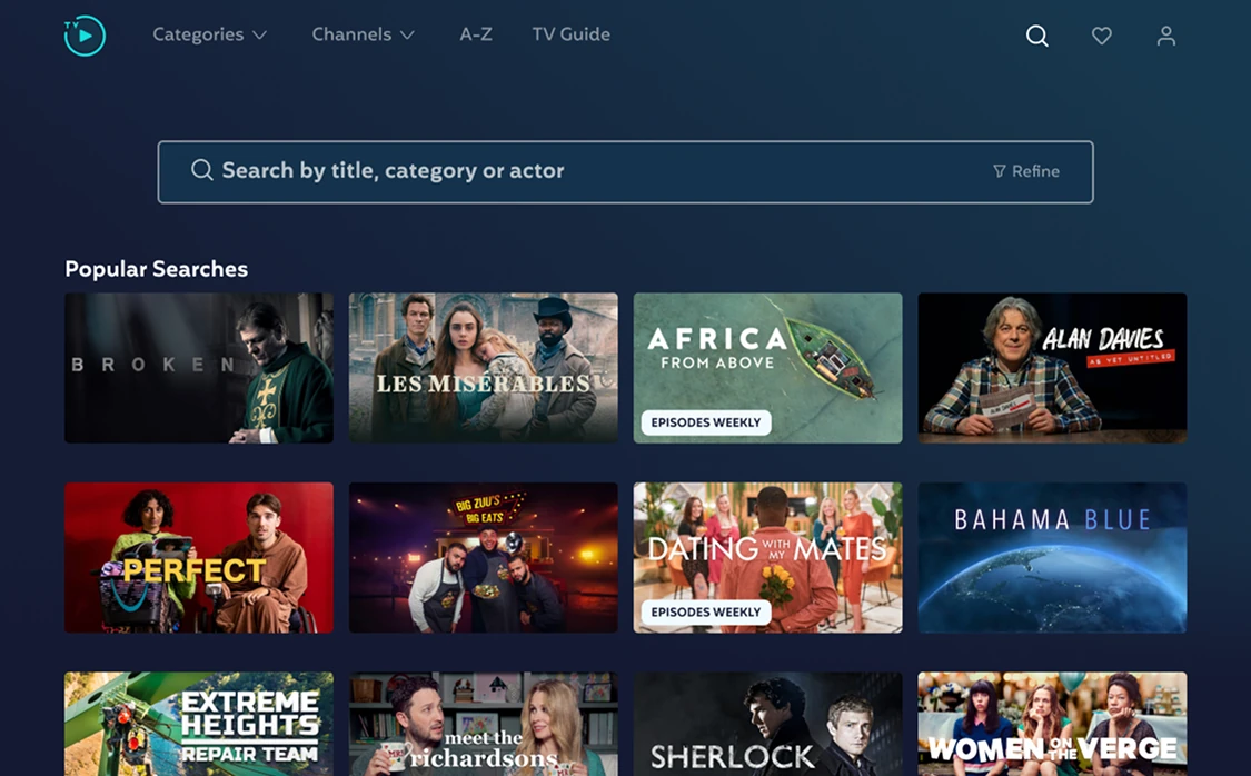
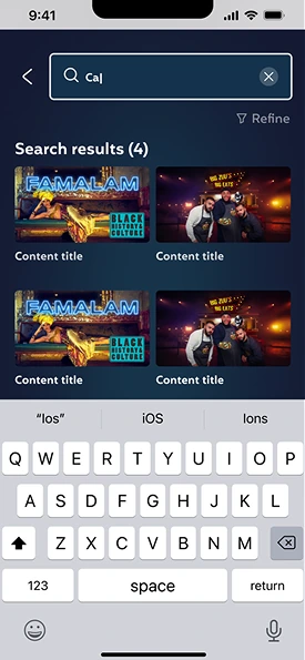
Familiar patterns from other streaming apps, with filters to make results more personal.
Why
Loyal viewers know what they want and rely on search, often with only part of a name.
The same product on web3 screens · desktop
Home, signed outThe value comes before the sign-up button.Show pageSame structure as on TV.Search
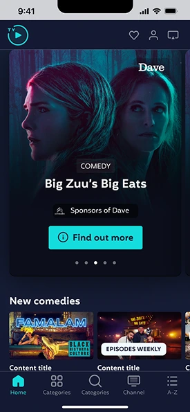
And on mobile
5 screens · iOS
Home
Channel
Search
RegistrationSmall steps, with a hint for each field.
PreferencesMerged with success after testing.
09 · Design system
One source of truth
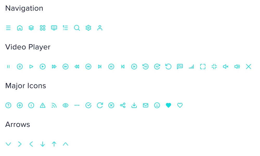
Built in Figma from scratch for web and CTV: colour, type, icons, grids and components. It kept the three platforms consistent and gave UKTV's developers one source of truth.
Navy blue#141932
Aqua#14DCDC
Red#E66464
Yellow#F5D796
Purple#B478CD
Green#82D782
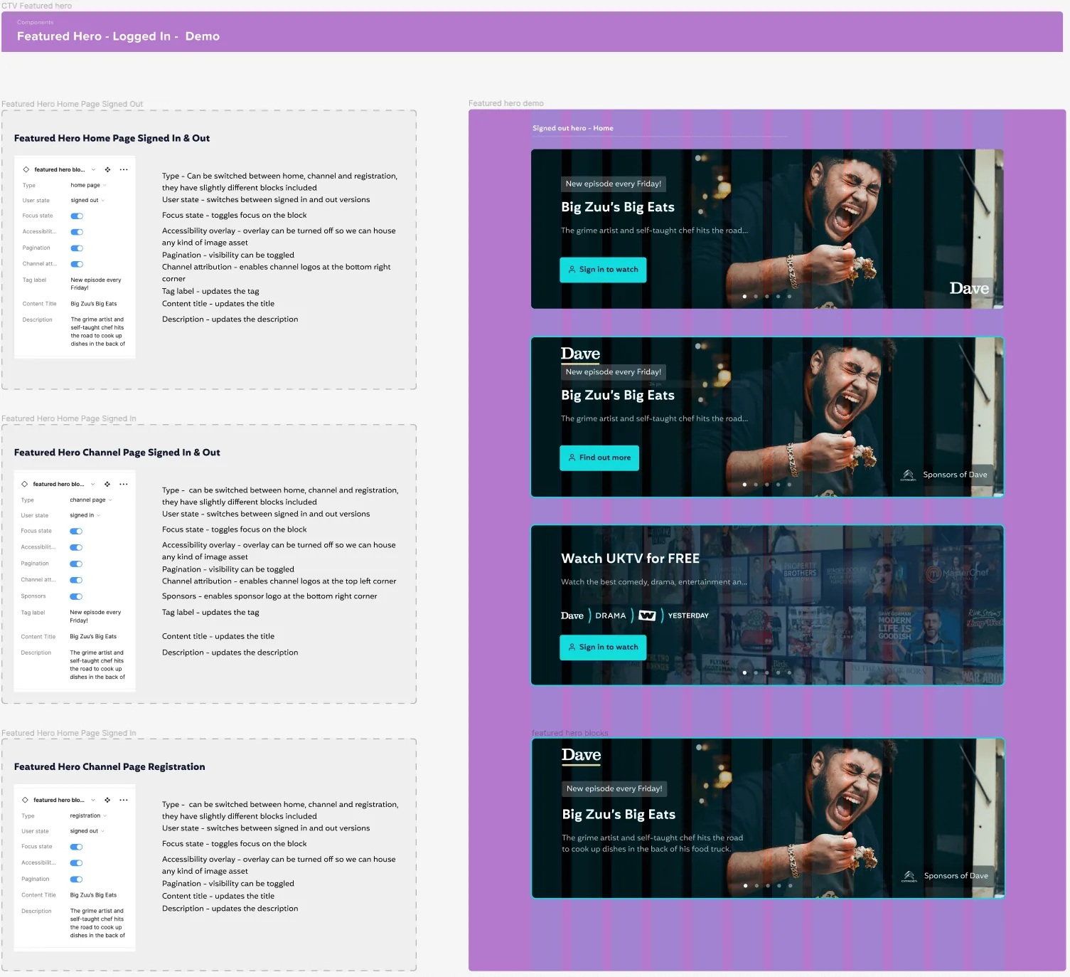
Featured hero component. Every state is a setting, so developers could see behaviour, not only visuals.
10 · Learnings
What I'd do differently
Bring engineering in earlier
Involving engineering earlier on some of the more complex CTV interactions would have reduced later iteration.
Small clarity wins move activation
The biggest learning for me was how much small clarity improvements in registration and linking can affect activation.
Ship personalisation sooner
Next I would want to ship personalisation rows sooner and measure content start rate and registration completion more tightly after launch.
 Francis, lapsed viewer
 James, younger viewer
 Helen, loyal linear viewer